FIM SPEEDWAY GRAND PRIX TOP TRUMPS
Brief
Project Overview
To celebrate 30 years of the FIM Speedway Grand Prix series, create a concept collectible card game inspired by the classic Top Trumps format. The aim is to produce a visually engaging card series that feels authentic to the current Speedway GP brand identity while appealing to motorsport fans and collectors.
Project Objectives
Celebrate the 30-year history of the Speedway Grand Prix series
Create a modern interpretation of the classic Top Trumps card format
Present rider statistics in a clear, engaging and competitive format
Develop a collectible product concept that appeals to both existing fans and new audiences
Target Audience
Speedway fans & motorsport enthusiasts
Sports memorabilia collectors
Younger audiences familiar with trading card and Top Trumps-style games
Creative Direction
The visual identity should take inspiration from the current Speedway GP branding system, using a bold and energetic motorsport aesthetic.
The overall look should feel modern, authentic and instantly recognisable within the Speedway GP brand landscape.
Deliverables
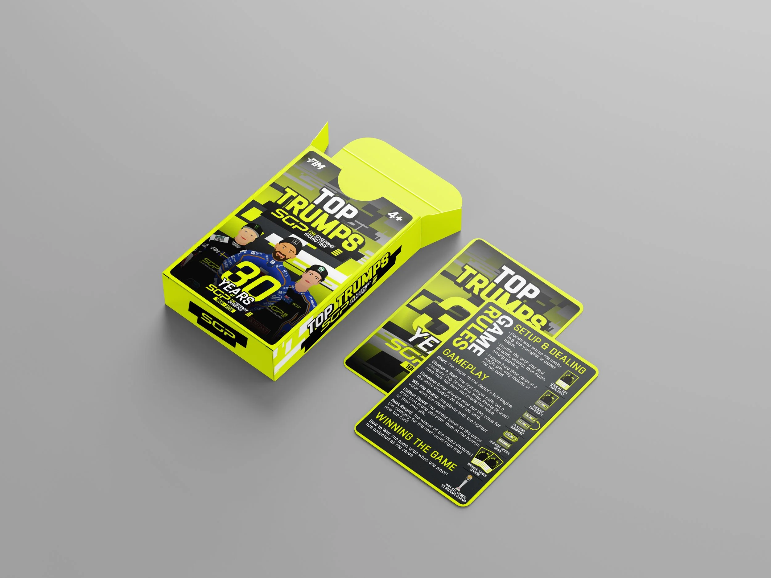
Top Trumps card design system
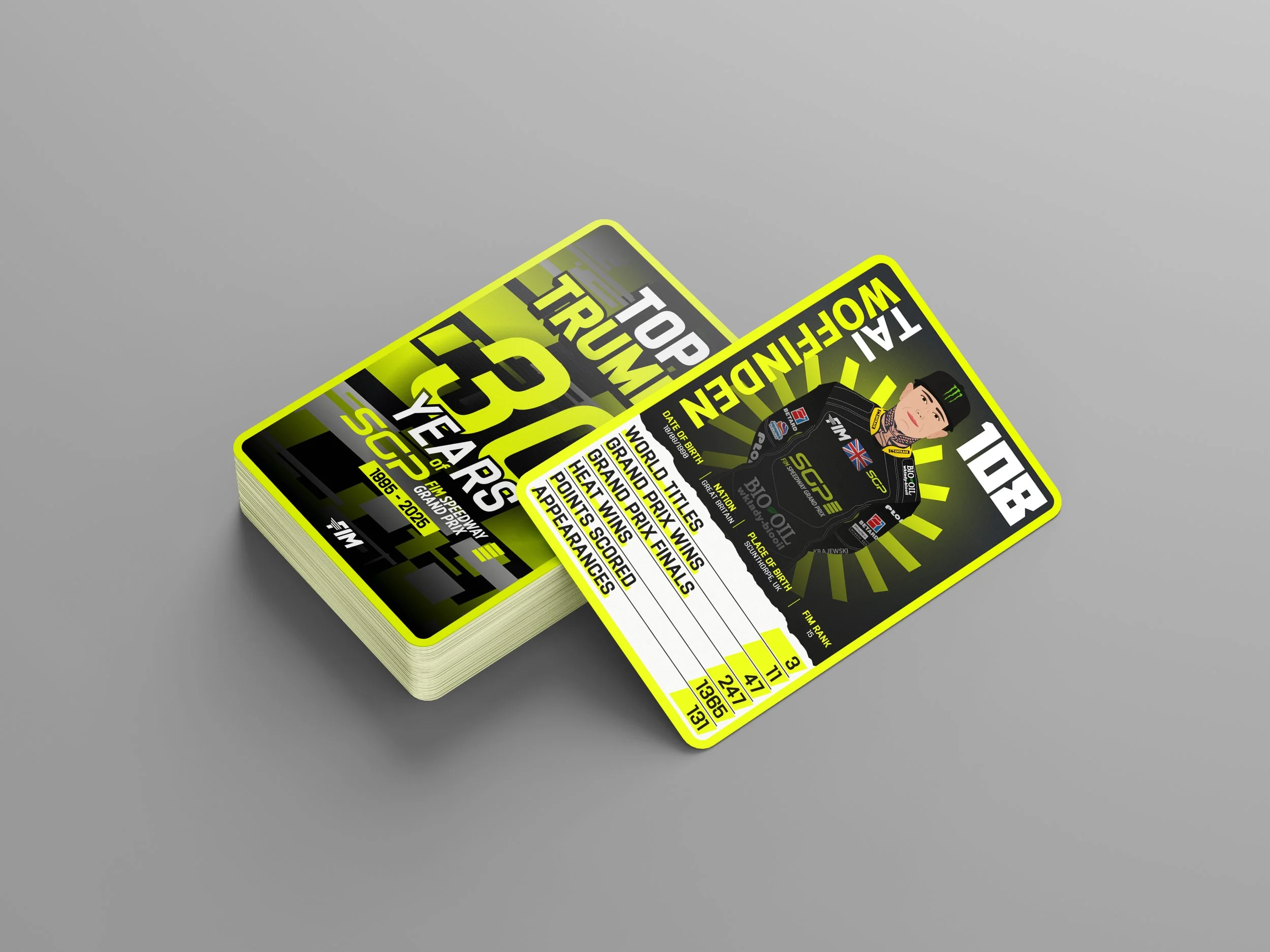
Front and back card layouts
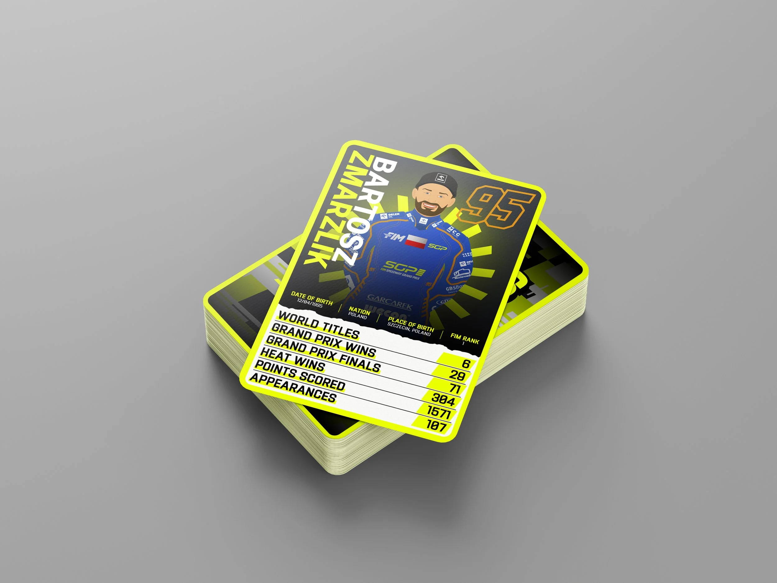
Rider profile templates
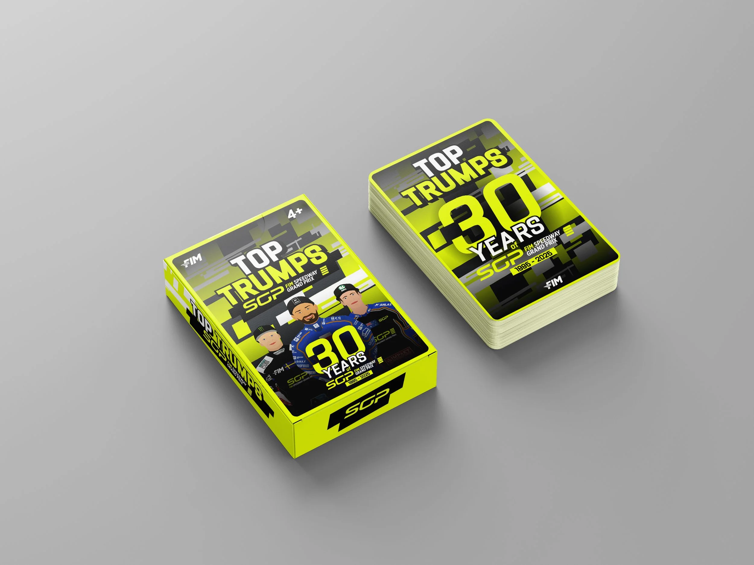
Packaging/mock-up concepts
Desired Outcome
The final concept should feel like an officially licensed Speedway Grand Prix collectible product, celebrating the history of the series through bold, contemporary graphic design and engaging statistical storytelling.
Design Overview:
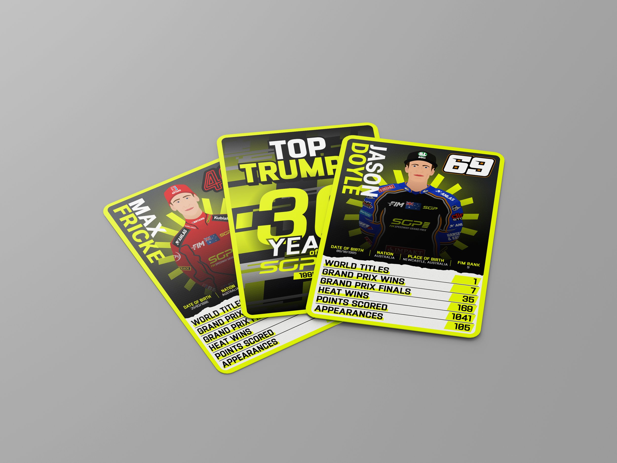
As this was a self-initiated concept project, I had the freedom to explore a more creative approach than would typically be possible within a commercial brief. During my research into existing Top Trumps products, I noticed that photography is often the dominant visual element of the card design. Rather than relying on rider photography, I wanted to create a solution that felt more unique and design-led.
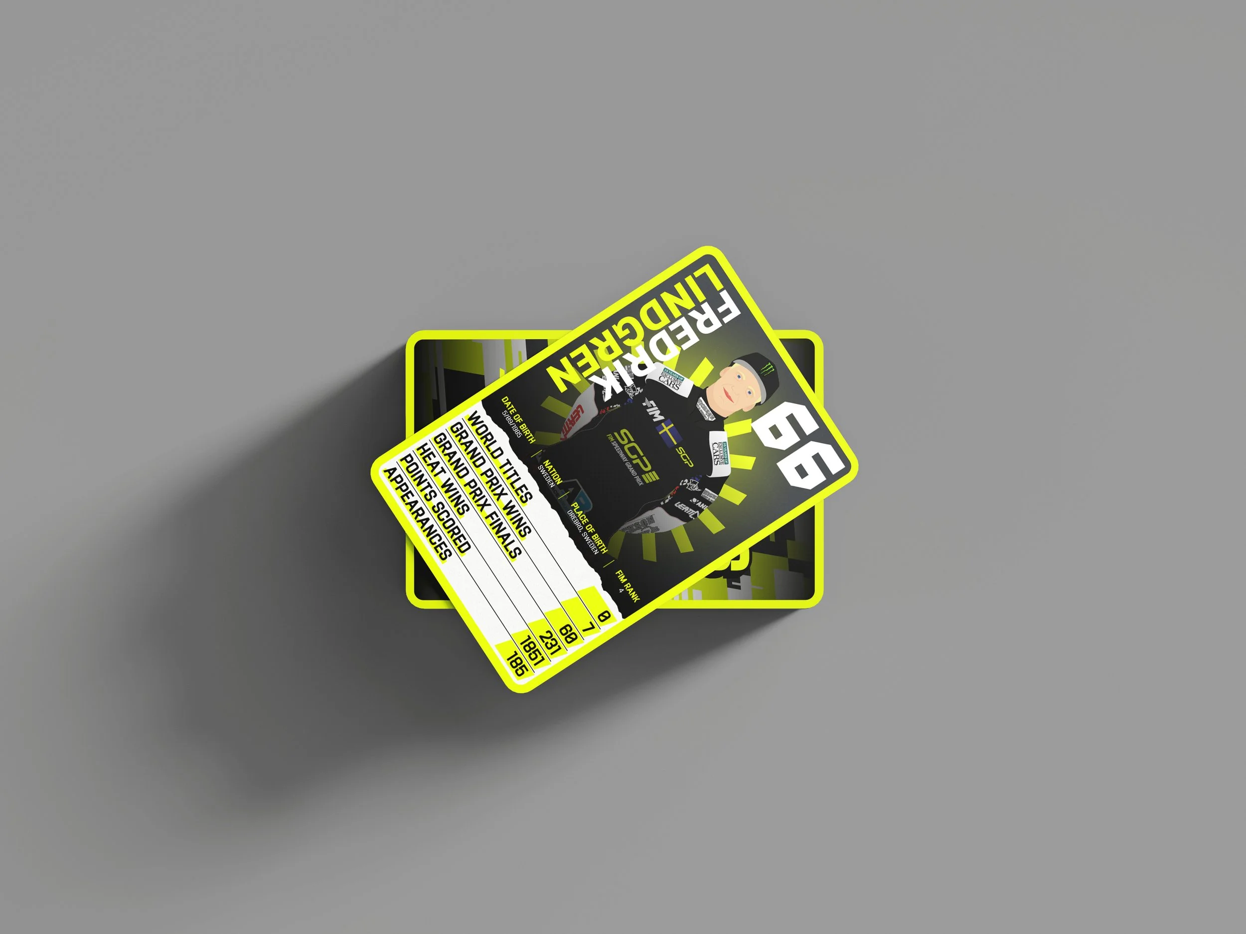
This decision led me to develop a fully illustrated card series, with each rider individually drawn in Adobe Illustrator. The aim was not to create perfectly realistic portraits, but to capture the characteristics and personality of each rider in a simplified, recognisable style. By doing this, the illustrations became a key part of the identity of the project rather than simply supporting the statistics.
To further strengthen the concept, I based the visual direction on the current Speedway Grand Prix branding. The use of fluorescent yellow, white and grey creates a strong connection to the modern championship identity while giving the cards a bold and contemporary feel. Careful consideration was also given to typography, colour hierarchy and information layout to ensure that the rider statistics remained clear and easy to compare during gameplay.
As the project celebrates 30 years of the Speedway Grand Prix series, I wanted the card set to represent both current and former riders who have competed throughout the championship's history. The selected categories—World Titles, Grand Prix Wins, Grand Prix Finals, Heat Wins, Points Scored and Appearances—were chosen to showcase different measures of success while creating balanced and engaging gameplay.
This project demonstrates my ability to interpret an established brand, develop a cohesive visual system, and communicate complex information through engaging design. It also showcases skills in sports graphic design, information hierarchy, collectible product design, layout system development, illustration, and typography. Ultimately, this was a personal passion project that allowed me to combine my interest in Speedway with my graphic design practice.