JACQUES PATCH SEED PACKAGING
Brief
Concept:
Create a front-facing seed packet design for Jacques Patch, a boutique British seed company specializing in native wildflowers. The packet should evoke natural beauty, sustainability, and British countryside charm — aiming to appeal to eco-conscious hobby gardeners.
Design Suggestions:
Use illustration or watercolour-style graphics to suggest hand-crafted quality.
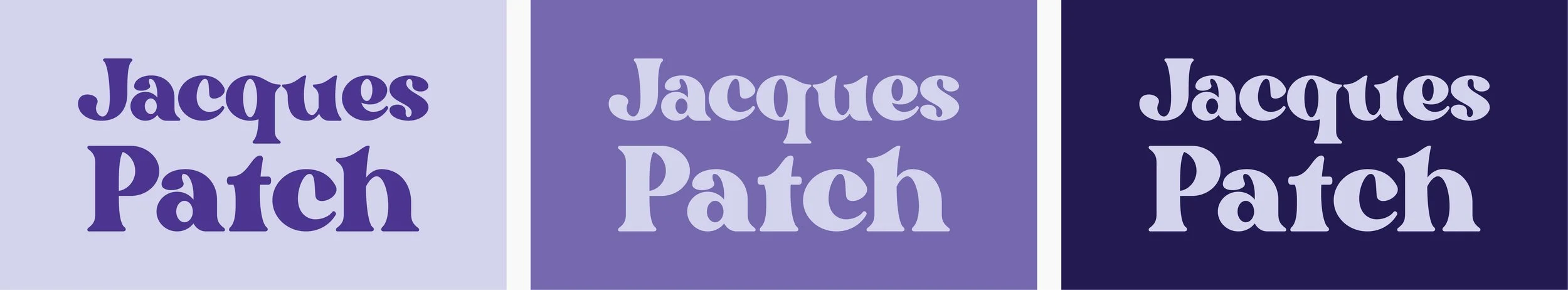
Typography should feel rustic yet refined — serif or elegant script fonts work well.
Consider muted tones inspired by nature: sage, wildflower yellow, lavender, clay.
Design Overview:
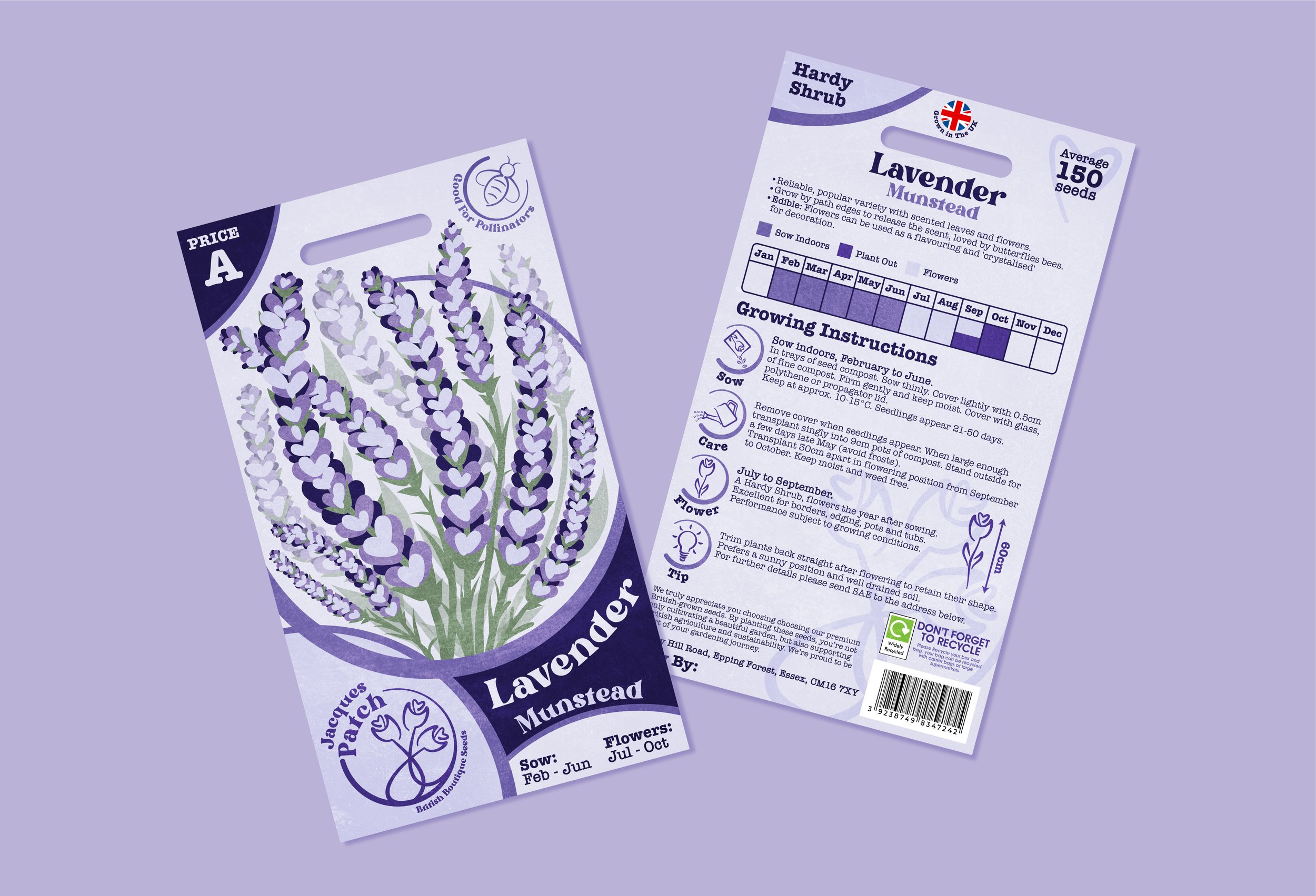
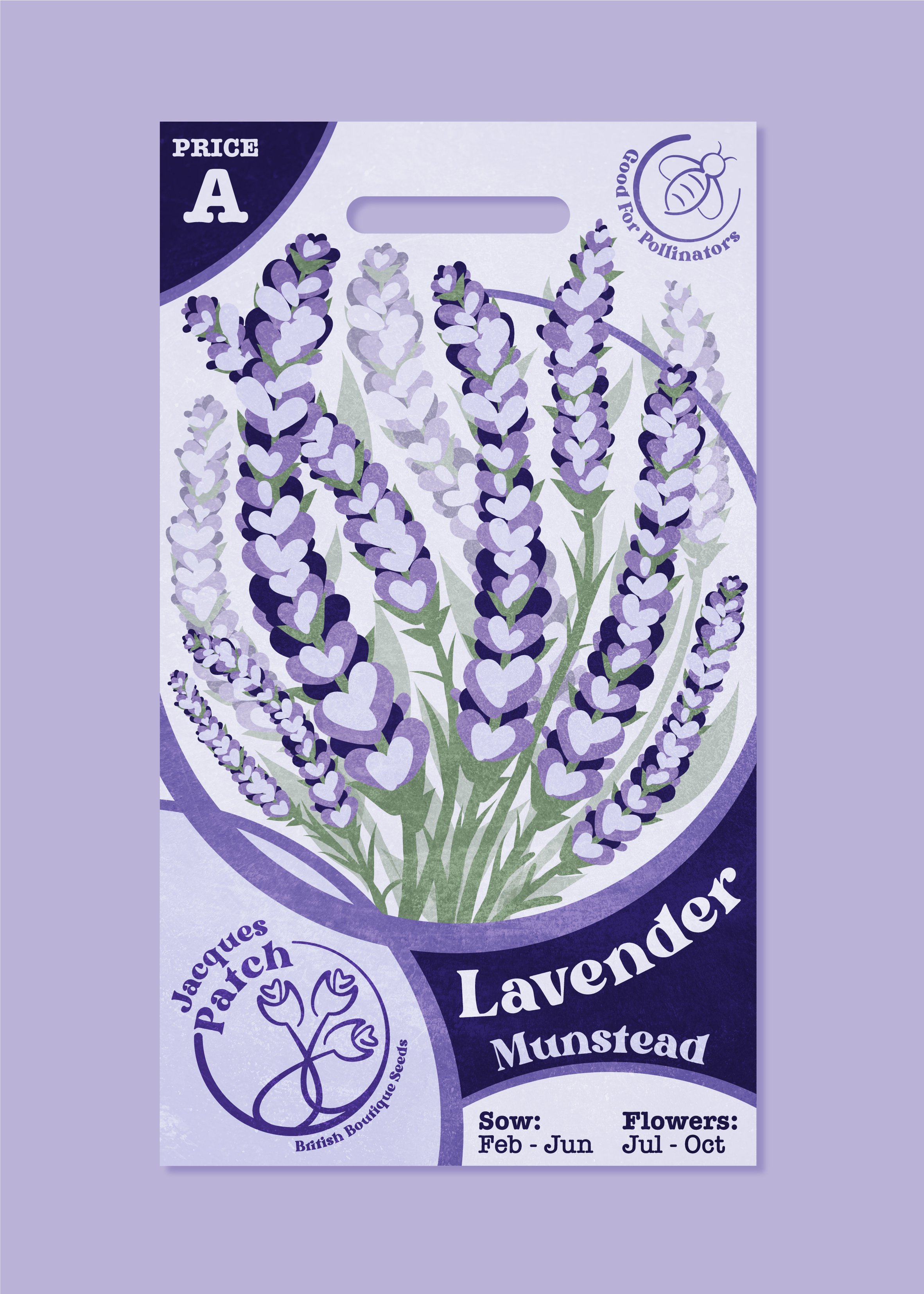
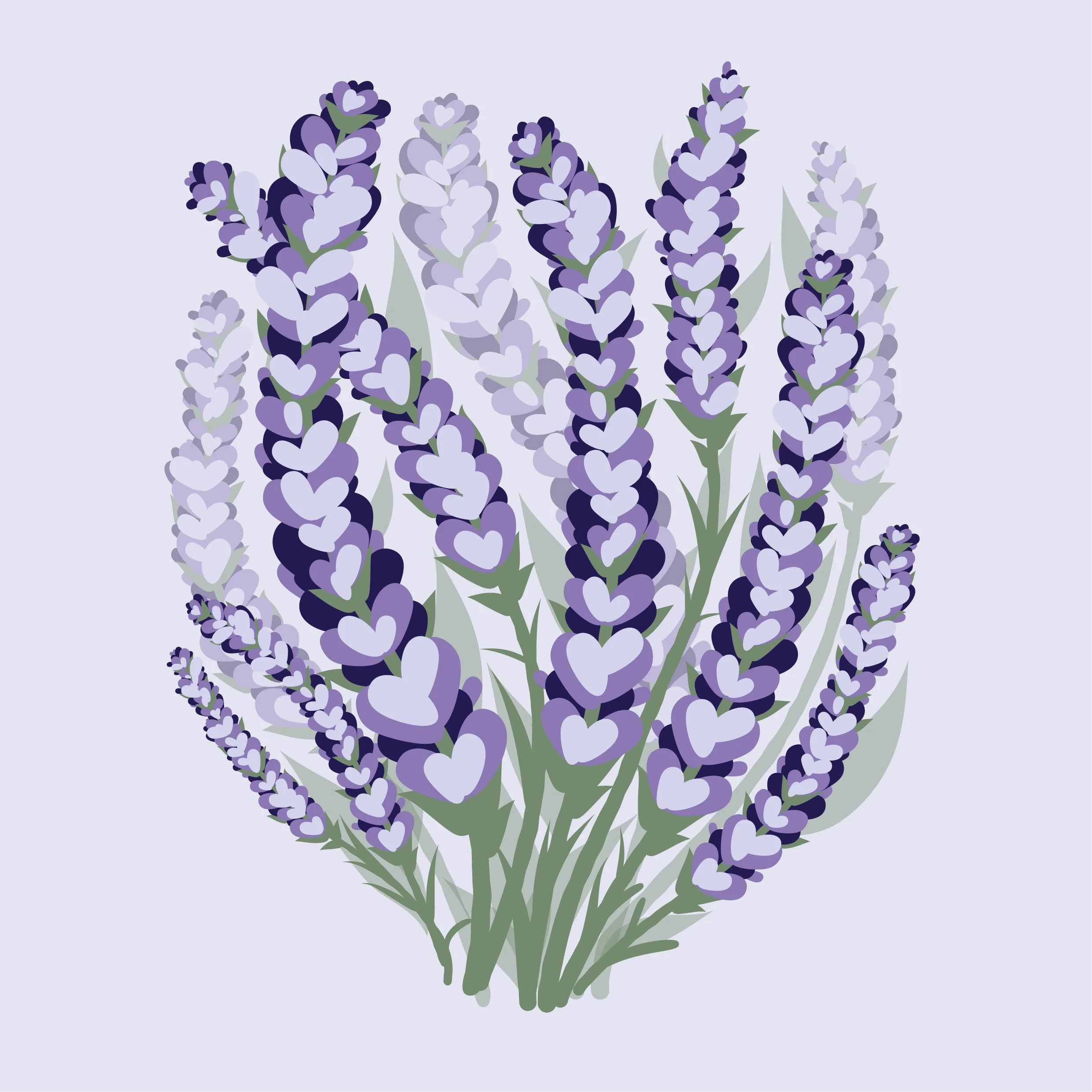
My personal design style is very much illustration. Because of this, I thought I’d lean into that and create a fully illustrator-based seed packet.
Starting off with the logo, I drew 3 simple but tasteful flowers that all produce a love heart in the middle. This is to suggest that each flower grown with Jacques Patch is grown with love. Then, all within a circle to imply, just like real flowers, growth moves in a circle beginning, blooming, and starting again.
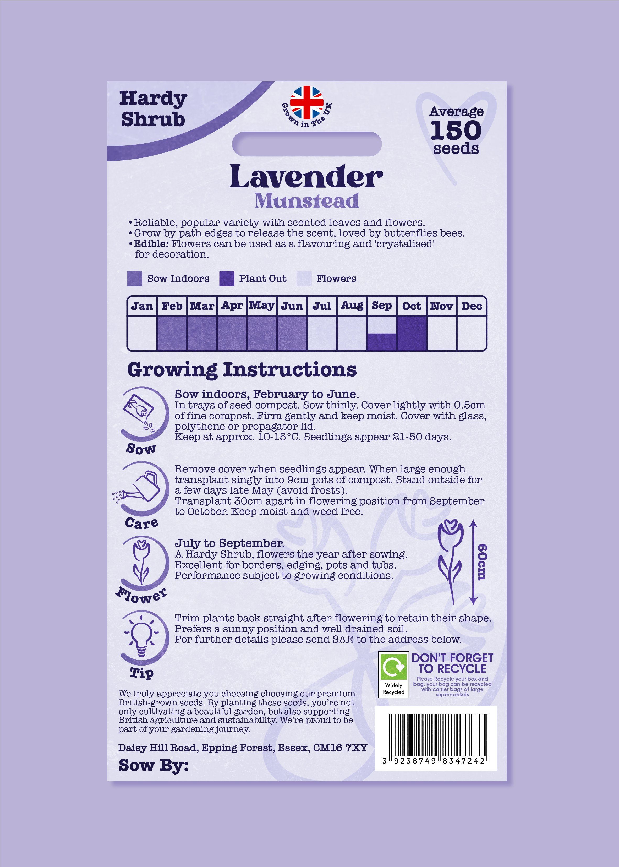
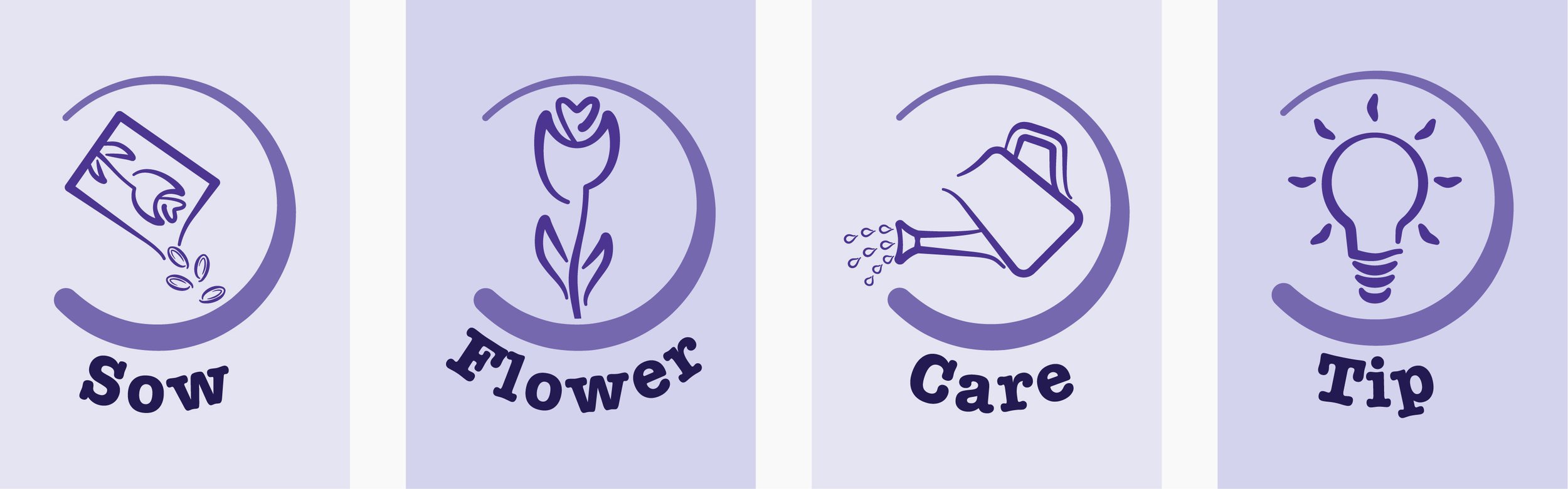
On this packet, I have used lavender colour tones throughout to provide that elegant feel. This also could mean the colours of the packet could be interchangeable depending on type of seeds within. I continued the circle aspect of the design throughout to tie in with the logo and the message of the circle of growth. I aimed for something easy on the eye for hobby gardeners and drew Illustrated icons to simplify the instructions to help get them started with their growing.